When it comes to creating a visually appealing and readable book, selecting the right fonts is essential. The typography of your book can greatly impact the overall reading experience for your audience.
In this comprehensive font guide for books, we will explore the best font choices for different genres, discuss the difference between serif and sans serif fonts, and share expert tips on font size and style selection.
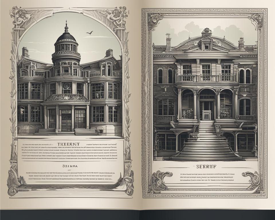
Key Takeaways:
- Choose fonts that align with the genre, target audience, and visual appeal of your book.
- Consider both serif and sans serif options and their respective characteristics.
- Pay attention to font size, readability, and overall design to ensure a pleasant reading experience.
- Recommended serif fonts for books include Garamond, Baskerville, and Minion.
- For a clean and modern look, consider sans serif fonts like Helvetica, Arial, and Roboto.
The Best Fonts for Print Books
When it comes to selecting the right fonts for print books, it’s important to choose options that create a formal and coherent impression. Serif fonts are highly popular in print books, as they offer a classic and timeless look.
On the other hand, sans serif fonts provide a clean and modern aesthetic. Let’s explore some of the best fonts for print books, including both serif and sans serif options:
Serif Fonts for Print Books
Serif fonts are recognized for their elegant and traditional style, making them a great choice for various book genres, such as novels, memoirs, and historical works. Here are some popular serif fonts used in print books:
- Garamond
- Times New Roman
- Century
- Georgia
- Palatino
- Merriweather
Sans Serif Fonts for Print Books
Sans serif fonts offer a clean and contemporary look, which makes them ideal for genres that require a more modern and minimalist design. Consider the following sans serif fonts for your print book:
- Helvetica
- Arial
- Futura
- Roboto
- Myriad
In addition to the main text, the font choice for a book cover is crucial in capturing the attention of potential readers. Several fonts work exceptionally well for book covers, including:
- Garamond
- Baskerville
- Bodoni
Remember, finding the perfect font for your print book involves considering the genre, style, and overall aesthetic you want to achieve. Take the time to explore different options and consider creating mockups to see how various fonts complement your book’s design.
| Serif Fonts | Sans Serif Fonts | Fonts for Book Covers |
|---|---|---|
| Garamond | Helvetica | Garamond |
| Times New Roman | Arial | Baskerville |
| Century | Futura | Bodoni |
| Georgia | Roboto | |
| Palatino | Myriad | |
| Merriweather |
Font Sizes for Print Books
The font size for print books plays a crucial role in ensuring readability and visual appeal. Different sections of a book, such as the main text, headlines, and book titles, require varying font sizes for optimal presentation. Here’s a breakdown of the recommended font sizes for print books:
Main Text:
For the main text of a print book, a font size of 10-12 points is commonly used. This range offers a balance between legibility and efficient use of page space. It allows readers to comfortably read the content without straining their eyes.
Headlines:
Headlines in a print book should have a font size that allows for one or two lines of text. This ensures that the headlines stand out while maintaining a cohesive design. A margin of approximately 10 points between subheadings and body text helps create visual distinction.
Book Titles:
Print book titles require larger font sizes to capture attention and create impact. Font sizes of 48 points and above are commonly used for book titles, making them visually striking on the cover or title page.
It’s important to note that these recommended font sizes are not set in stone and can vary based on the book’s design and target audience.
Experimenting with different font sizes during the layout process can help achieve the desired aesthetic and readability.
| Section | Font Size (Points) |
|---|---|
| Main Text | 10-12 |
| Headlines | Varies, allowing for one or two lines |
| Book Titles | 48 and above |
Choosing Fonts for eBooks
When it comes to selecting fonts for eBooks, it’s crucial to prioritize readability across various eReaders and screen sizes.
By using standard fonts, you can ensure maximum legibility and accessibility for your readers. Here are some highly recommended fonts for eBooks:
| Standard Fonts for eBooks |
|---|
| Arial |
| Times New Roman |
| Courier |
These fonts, including Arial, Times New Roman, and Courier, are known for their lucidity and readability, making them excellent choices for eBook typography.
Additionally, it’s essential to consider font attributes that can enhance the visual appeal of your eBook.
Adding attributes like bold and italics can make specific words or phrases stand out, improving the overall reading experience. However, it’s important to use these attributes sparingly to maintain readability.
Font sizes also play a significant role in eBook design. For chapter titles, it’s recommended to set the font size between 14 to 18 points, ensuring they grab the reader’s attention.
Meanwhile, the body text should have a font size of 12 points, offering a comfortable reading experience.
It’s worth noting that readers can adjust the font size according to their preferences after converting the eBook to EPUB format.
https://www.youtube.com/watch?v=3TkkQkbMSNc
By selecting the right fonts for your eBooks and paying attention to font attributes and sizes, you can create visually appealing and immersive reading experiences for your audience.
Font Choices for Children’s Books
When it comes to creating captivating children’s books, font choices and sizes play a crucial role in engaging young readers.
The font style and size should align with the tone and illustrations of the book, enhancing the overall reading experience.
Both serif and sans serif fonts can be suitable for children’s books, depending on the length and target age group.
For picture books with large illustrations and minimal text, a font size of 18 points or greater is commonly used to ensure readability.
The larger font size helps draw attention to the text and allows young readers to easily follow along with the story.
Serif fonts, with their decorative flourishes, can bring a touch of warmth and playfulness to children’s books. Some popular serif font choices include Myriad Pro, Georgia, Plantin Infants, Alegreya, Garamond Pro, Crimson, Baskerville Old Face, and Century Schoolbook.
These fonts add charm and character to the text while maintaining readability.
On the other hand, sans serif fonts offer a clean and modern look that can complement contemporary illustrations and design styles.
Recommended sans serif fonts for children’s books include Andika, Helvetica, Gill Sans, Quicksand, Century Gothic, Avenir Next, and Lato. These fonts provide a clean and straightforward reading experience, making it easier for young readers to focus on the content.
Choosing the right font for children’s books requires careful consideration of the book’s theme, target age group, and overall aesthetic.
By selecting appropriate font choices and sizes, authors and designers can create visually appealing and reader-friendly books that captivate the imaginations of young readers.
| Serif Fonts | Sans Serif Fonts |
|---|---|
| Myriad Pro | Andika |
| Georgia | Helvetica |
| Plantin Infants | Gill Sans |
| Alegreya | Quicksand |
| Garamond Pro | Century Gothic |
| Crimson | Avenir Next |
| Baskerville Old Face | Lato |
| Century Schoolbook |
Popular Serif and Sans Serif Fonts for Children’s Books
Font Selection for Nonfiction Books
When it comes to nonfiction books, choosing the right font is crucial for creating an engaging and professional reading experience.
The font selection plays a significant role in conveying the tone and enhancing the overall presentation of the content.
For nonfiction books, it is recommended to use serif fonts. Serif fonts are known for their readability and timeless appeal, making them an ideal choice for conveying information effectively. Some of the best serif fonts for nonfiction books include:
- Garamond
- Baskerville
- Minion
These fonts offer a combination of elegance, legibility, and versatility, making them suitable for a wide range of nonfiction genres.
When it comes to font size, nonfiction books typically use a standard font size of 12 points.
However, depending on the specific book and genre, the font size may vary between 10 to 14 points. This range ensures optimal readability and consistency with other works in the same genre.
Take a look at the example below to see how fonts can influence the visual appeal of a nonfiction book:
As you can see, the choice of font can significantly impact the aesthetics and readability of the text.
The example above showcases different serif fonts used for nonfiction book titles, providing a glimpse into the diverse options available to authors and designers.
When selecting fonts for your nonfiction book, consider the genre, target audience, and the message you aim to convey.
Experiment with different combinations and seek feedback from professionals or beta readers to ensure the font choices align with the purpose and content of your book.
Font Choices for Poetry Books
Poetry books offer more flexibility when it comes to font choices. The size and genre of the book can influence the selection of fonts.
In most poetry books, sans serif fonts with point sizes ranging from 10-12 are commonly used. These fonts ensure readability without distracting from the poetry itself.
However, poets have the freedom to use any typeface that captures the essence of their poems.
When it comes to serif fonts, several options are popular for poetry books:
| Serif Fonts for Poetry Books |
|---|
| Baskerville |
| Garamond |
| Palatino |
| Janson |
| Verdana |
| Optima |
| Helvetica |
These serif fonts offer a classic and elegant look, complementing the artistic nature of poetry. Each font has its own unique characteristics, allowing poets to choose the one that best represents their style and voice.
By selecting the right fonts for their poetry books, poets can enhance the reader’s experience and visually convey the emotions and meaning of their poems.
FAQ
What are the best fonts for print books?
Some popular serif fonts for print books include Garamond, Times New Roman, Century, Georgia, Palatino, and Merriweather.
For sans serif fonts, Helvetica, Arial, Futura, Roboto, and Myriad are recommended. Garamond, Baskerville, and Bodoni are popular choices for book covers.
What font sizes should I use for print books?
For the main text, a font size of 10-12 points is commonly used. Headlines should be sized to allow for one or two lines, with approximately 10 points margin between subheadings and body text. Print book title fonts typically use larger sizes, such as 48 points and above.
What fonts should I choose for eBooks?
Stick to standard fonts that ensure maximum readability across various eReaders and screen sizes, such as Arial, Times New Roman, and Courier.
Pay attention to font attributes like bold and italics. For font size, chapter titles are typically set between 14-18 points, while body text should use a font size of 12 points.
What font choices and sizes are suitable for children’s books?
Font choices and sizes should match the tone and illustrations of the book. For picture books, a font size of 18 points or greater is commonly used.
Serif fonts like Myriad Pro, Georgia, and Garamond Pro, as well as sans serif fonts like Andika, Helvetica, and Gill Sans, are often recommended.
What fonts should I use for nonfiction books?
Some recommended serif fonts for nonfiction books include Garamond, Baskerville, and Minion. The standard font size for nonfiction books is 12 points, although it may range from 10 to 14 points depending on the genre.
What are the best fonts for poetry books?
Sans serif fonts with point sizes ranging from 10-12 are commonly used in poetry books to ensure readability without distracting from the poetry itself.
However, any typeface that captures the essence of the poem can be used. Popular serif fonts for poetry books include Baskerville, Garamond, and Palatino.
Conclusion
Selecting the right font for your book is critical to creating an appealing and professional-looking design. Whether it’s a print book or eBook, serif or sans serif, the font choices should align with the genre, target audience, and visual appeal of the book.
When making font decisions, consider factors such as font size, readability, and overall design.
Remember, fonts have the power to influence the tone and mood of your book, so choose wisely to enhance the reading experience for your audience.